
Typography is far more than just picking a pretty font; in fact, it is the craft of organizing text to make language visible, legible, and evocative. Whether you are designing a sleek interface or laying out a classic print book, mastering typography basics is essential for effective visual communication across modern media.
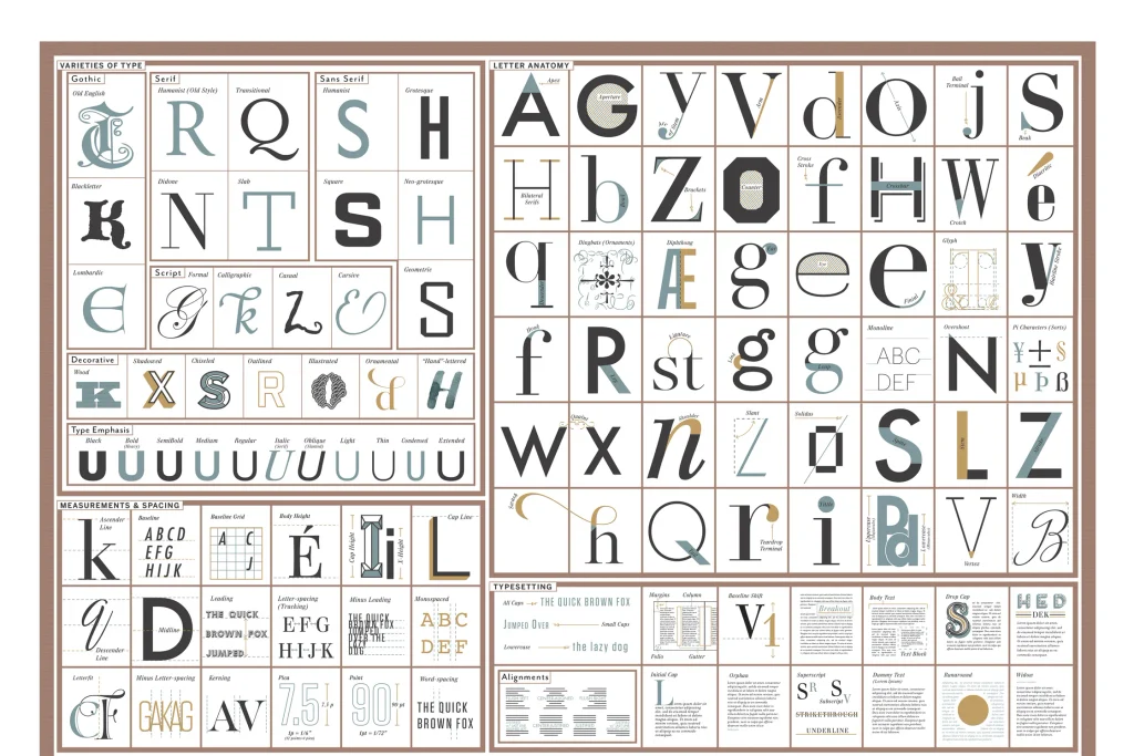
Typography basics and typeface classifications guideFour Core Principles of Typography Basics
To build a solid foundation, you need to understand the fundamental mechanics that define great typesetting:
- Typeface Classifications: First of all, this is your primary toolkit. Serif fonts like Times New Roman possess decorative feet, which convey tradition and authority. In contrast, modern Sans-Serif fonts like Helvetica lack these feet, therefore offering high legibility across digital screens. You can explore a wide variety of open-source fonts on Google Fonts for your next project.
- Visual Hierarchy: In addition, visual hierarchy guides the reader through your content. You cannot make every element the same size. Consequently, using contrast in weight and scale helps the human eye identify the most important topic immediately.
- Spacing Matters: Furthermore, spacing is often the invisible differentiator of good design. Adjusting tracking and kerning prevents awkward gaps between characters. Meanwhile, setting line height to 1.4 or 1.6 times the font size ensures the reader jumps comfortably from one line to the next.
- Line Length: Finally, keep the width of your text block comfortable. If a line is too long, the eyes tire easily; on the other hand, lines that are too short disrupt the reading flow.
Key Takeaways for Better Layouts
As a result, when in doubt, always prioritize consistency and restraint. Restrict a single design to two well-chosen typeface families to maintain clarity, and let the white space do the work effectively. If you want to see how these layout guidelines come together in actual screen design, feel free to check out my recent portfolio projects for interactive layout examples.
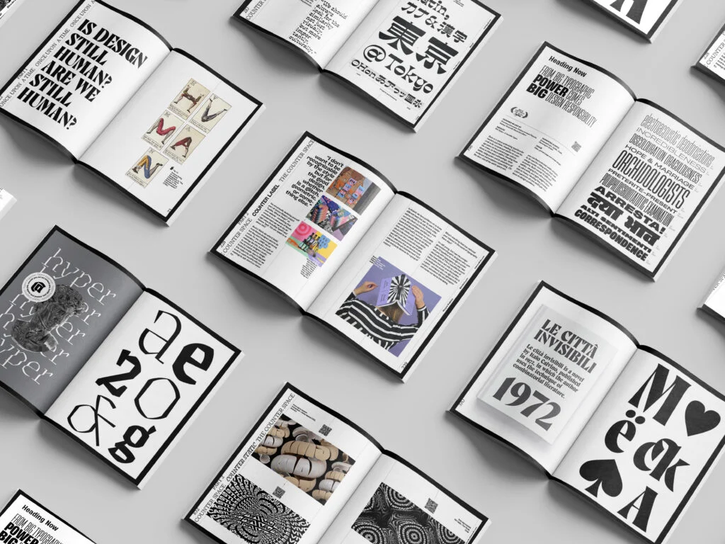
To further expand your design skills, here are several industry-standard video tutorials that break down typography in practical scenarios:
- The Futur – Typography Tutorial – 10 rules to help you rule type: An essential deep-dive into visual hierarchy, grid systems, and layout psychology led by Chris Do.
- Envato Tuts+ – Beginning Graphic Design: Typography: A clear, visual breakdown of letterform anatomy, serif vs. sans-serif, and practical pairing rules.
Flux Academy – 5 Web Typography Rules That Will Improve Your UI Design: A practical guide tailored for web and UI designers focusing on responsive scale, line length, and readability.
Want to see what I’m currently working on? Feel free to explore my full design showcase on my Portfolio, or connect with me on Facebook for behind-the-scenes updates, creative inspiration, and design resources. Let’s stay connected!
Leave a Reply